Skouf.com redesign - part 1
When I was young and naive, I built a website for myself by cobbling together a design I found, some custom css, and manually hacking in some features I liked. It sort of worked on mobile, but not that well. It was hard to update, kind of ugly (in hindsight), and not really conducive to maintenance and updates. The content on there, the things it shows off, are dated and not really reflective of the engineer that I’ve grown to be, or the interests I have. Those projects are a reflection of me, fresh out of uni, with some (again, in hindsight) frankly terrible toy projects that I’d be kind of horrified to show prospective employers or even colleagues.
 as it appeared on 18/04/2022](/posts/skouf-dot-com-redesign-part-1/skouf-dot-com-current.jpg)
What skouf.com looks like as of 18/04/2022
Another thing that’s apparent is that the website isn’t fit for purpose anymore. When I built it, it was a toy. I got to play around with some fun tech. And I got to show off to people, because in my social and uni circles at the time, having your own domain and a website was somewhat novel. At this point it’s probably more of an embarrassment than something I’d want to show off to colleagues, and friends are more likely to want to see blog entries rather than anything that’s on skouf.com.
If there’s one thing I’ve learned when it comes to personal projects over the last few years, it’s that my interest in them is extremely bursty. That’s how you’re getting this blog post! I’ll spend a few weekends hacking on something, get it to a point that it works, and then not touch it again for roughly 12 months. This presents a few suggestions for what to optimise for when I’m creating a personal project:
- The docs should be excellent. Thankfully, this isn’t something out of the ordinary, and if anything, creating personal projects in the past that are documented terribly has encouraged me to internalise and practice writing great docs. The code that builds and deploys these docs is probably a good example of that. I’ve managed to come back to it now a few times, and creating new entries, building and deploying has been easy and simple each time.
- Simplicity is a virtue. The biggest example of this was probably my convoluted Matchbox/Ignition/PXE boot Kubernetes setup that I detailed in my IAC in the home article. A year on, I couldn’t remember how any of it worked and had to start from scratch. This is also probably tied to good docs, but complexity also introduces additional things that can (and will) break. Complexity is not durable.
- The world will move on. Nothing really to hedge against here. What was state-of-the-art 12 months ago likely isn’t state-of-the-art now. Rewrites are inevitable. Use them as an opportunity to catch up to the zeitgeist.
Looking at those three points, they’re probably true of any project rather than just personal projects. Who knew?
With all of that in mind, it was time for a re-write of skouf.com, with a few goals:
- Build with the learnings above about documentation, simplicity, and the pace of the industry in mind.
- Build in a way that it can be updated easily, to account for growth as an engineer and a person.
- Build for the audiences I care about, and make it easy for them to get their jobs done.
- Build the website itself in such a way that I learn from it, because my frontend skills are pretty rusty.
- Build so that the site itself is a project I’m proud of.
With those goals in mind, off we go!
Design thinking
Lately at work I’ve been doing a bunch of product thinking, and iterating on how we go from rough ideas and a product-shaped hole to delivering specific outcomes that meet customer needs. A tool I’ve been reaching for is design thinking, and specifically, the design thinking double diamond approach to designing software and products. I was introduced to this methodology primarily through Hackathons, and I’ve been pretty happy with the sorts of results it produces. I like that it’s not terribly prescriptive, meaning that it’s flexible and can be adapted to lots of different types of design problems. It’s also iterative in nature, and iteration leads to better design.
There are probably as many techniques for doing design thinking as there are frontend frameworks. Choosing one can lead to decision paralysis. Instead, I think it’s more important to just have some sort of process, regardless of whether it’s the ‘right’ process. It’s the act of thinking about the design of whatever you’re building that nudges you towards better choices, not the specific steps that you take.
Persona mapping
Something I’ve enjoyed in the past to kick-start the ‘Discover’ phase of design thinking is persona mapping. I think what appeals to me is an ’extremist’ style of personas, that helps you understand the extremes of the audiences you are designing for. Once you’ve explored the extremes of the solution space, you’re better equipped to understand what ’too far’ towards and extreme looks like. Hopefully, this leads you to make better and more informed decisions about the tradeoffs required to please all of your potential audiences.
With that in mind, here are the personas I came up with for my site
“The Recruiter” - Sarah

The image I chose to represent the recruiter persona. Not a real human, I used generated.photos to generate this face.
Age: 29
Job title: Senior recruiter
Location: Brussels, Belgium
Quote: “I find the best candidates, that are the right cultural and technical fit for our organisation”
Bio: Tech recruiter working for a growing, medium-sized tech company with startup roots, but that has grown aggressively and has big ambitions. No formal background in recruiting or tech, but has always worked in roles that involve interacting with people. Came to their current job to work with great people, and because the values of the organisation match their own.
Principles and values:
- Everyone is equal, but not everyone is going to make a great fit
- Don’t let perfect be the enemy of good
- You have to play the game to understand the rules
Goals:
- Finding great candidates before other recruiters get to them
- Meeting the needs of a growing organisation, in numbers but also in experience and in-demand skills
- Getting home on time, and not letting work get in the way of life
Motivations:
- Finding a role that is the perfect fit for a candidate as well as the business.
- Seeing candidates thrive once they’ve started at the business.
- Working with other recruiters to get the best outcome for the business - swapping candidates and helping each other out with our open roles.
Frustrations:
- Lots to do, and not much time to do it in
- Engineering managers that don’t understand the hiring market
- Candidates who look good on paper but turn out to be duds
- Niche roles - people that are hard to find, and the added complexity of the subtlety of differences between how people self identify vs what your org is looking for
“The Friend” - Nathan

The image I chose to represent the friend persona. Not a real human, I used generated.photos to generate this face.
Age: 25
Job title: Teacher
Location: Brisbane, Australia
Quote: “I’d love to recreate that dish Nik made for a party next week. How did he make it so delicious?”
Bio: Single guy working as a teacher. Loves food and cooking, craft beer, and video games. Working as a teacher which is pretty good, but work is a means to an end. Frustrated by the state of the world, and trying to do small things about it, and education is a great way of achieving that. Not sure what the future holds, but things are pretty good at the moment.
Principles and values:
- Leave the world a better place than you found it
- Good food with good friends is one of life’s greatest joys
- I’m not sure what the future holds, but I’m playing my part in steering it in a good direction
Goals:
- Wants to cook and eat delicious things, and know where to learn more (even if I don’t get around to it - life is busy)
- Poke around some tech stuff if I can understand it.
- Share things with friends, because this stuff is cool and I want others to know about it and pass on the favor of knowledge
Motivations:
- Eating delicious things
- Food and cooking are tied to identity. Not strongly, but more than anyone else in my circle.
- Sharing information or cool links, because that’s what we do in our circle.
- Learning is a worthwhile pursuit, in and of itself
Frustrations:
- Lots to do, and not much time to do it in
- Too much preamble before the recipe, I’ll go back and read that later.
- I want to understand, but this recipe is pretty complex and assumes a lot of knowledge. I’m happy to research, but I might need some pointers
From personas to design ideas
There are definitely some themes here, but I think the best way to represent the ideas that it generated for me are through the ‘Discover’ phase of the design thinking double diamond. To make sure that I accurately represented each of my personas, I used the following method:
- Read one of the personas, trying to really internalise their feelings and thoughts.
- Spend 4 minutes brainstorming, trying to empathise with that persona
- Read the other persona, and repeat
- Finally, spend 4 minutes brainstorming without a persona, to see what else you can capture
Here is what I came up with:
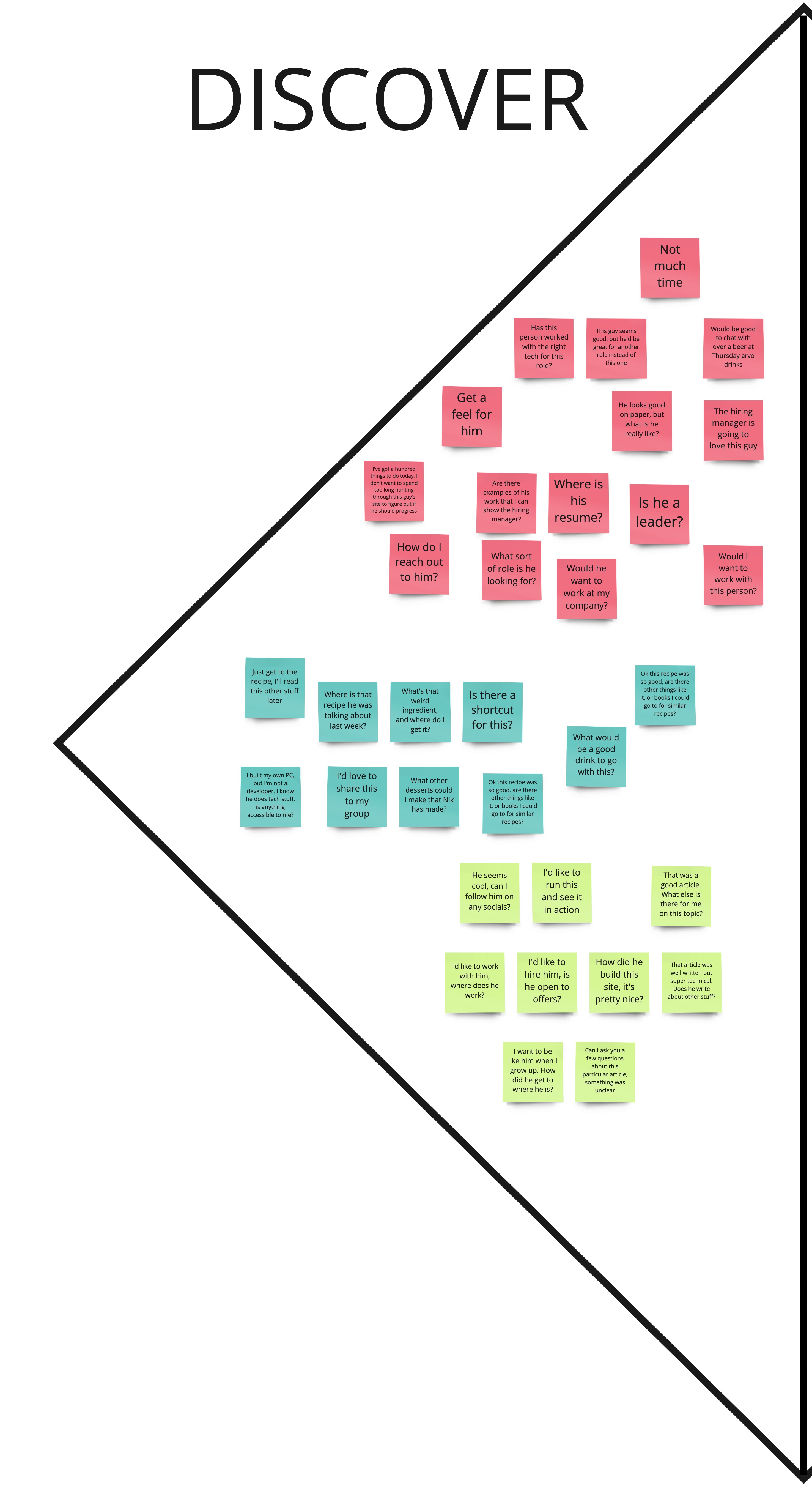
The ‘discover’ phase of my design thinking
After this, I did some grouping into themes or ideas over in the ‘Define’ section. Here’s where I ended up:
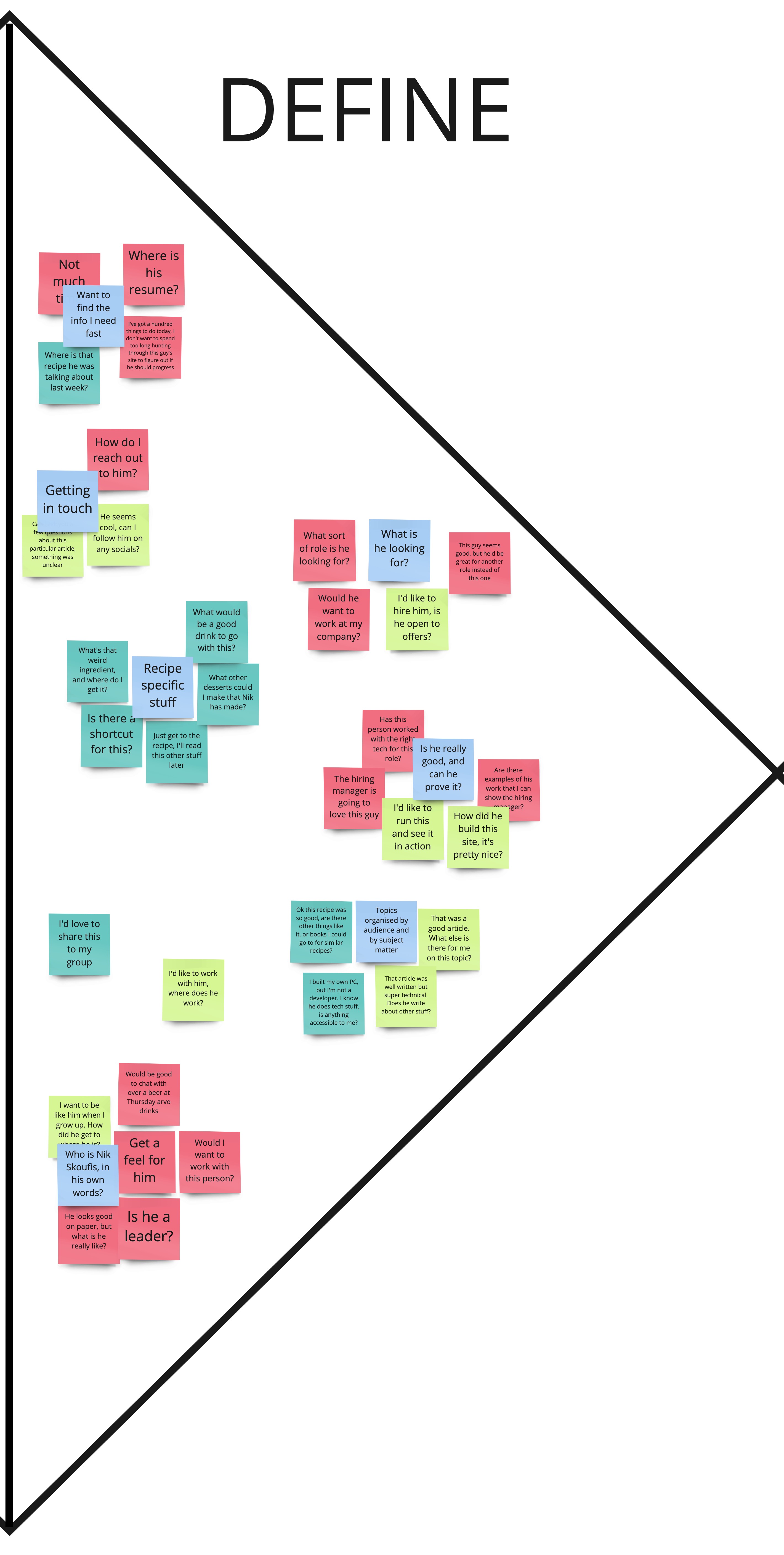
The ‘define’ phase of my design thinking
Something interesting and worth noting here: while doing my brainstorming, there’s a clearly missing persona from my thinking above. This persona is that of someone technical, who might have come across my site through Google or because someone else linked to it, and wants to have a bit of a look around. They probably don’t care about any food stuff, and want to be guided to posts with similar topics to what they’ve just read. This persona might be something like ‘The Colleague’ or ‘The Developer’ or something like that.
I elected not to go back and create a persona around this, but I could have. The point of doing all of this design stuff isn’t necessarily that it is perfect, but that it’s deliberate and you have some sort of plan. Missing a persona, but finding it naturally in the ideas that follow after you did create some personas is a good example of this.
Broad design principles
At this point, I feel like I’m starting to get a bit of a feel for how I’m going to design this website.
To fill in some required detail here, I have a site at skouf.com which I figure is going to be the entry-point for
lots of folks.
It’s easy to just point people there and be done with it.
However, I also have a blog at blog.skouf.com which is a separate Hugo-based static site.
With that context, some of the information below points clearly to things that need to be on the main skouf.com site.
This includes stuff like contact details, signposting stuff, probably employment things, and a bio.
There’s also things that are likely enhancements to the blog, but that may also warrant their own place on the main
skouf.com site, likely as links off to blog.skouf.com.
Here are some of the broad themes that will shape this re-design.
Two clear ’types’ of users
It seems pretty clear to me that there are two clear ’types’ of users of my site:
- People looking to hire me for work
- People looking for content that I’ve created
These two groups have some shared needs, but also have pretty different interaction patterns.
The people looking to hire me want to make a decision about whether I’m worth their time to get in touch with, or to progress to the next round of a hiring process. They need a bunch of things from me to do this, and they need to do it fast, because they’re busy and I’m just another candidate in a sea of developers. I need to stand out, but also, want to make their lives easy. This points to big, easy to find links to the stuff they want: resume, bio, contact info, what I’m looking for in a job.
The other people are either friends and family looking for food stuff, or general internet denizens looking for food or tech info. These people have a different interaction mode. They’re either looking for a specific thing because they’ve heard me mention it. Or they’re looking for information organised around a topic: either more of the same, or more by me on a slightly different topic.
Given the large difference in these interaction modes, I’m thinking about implementing something that I’ve seen in the past and enjoyed: the explicit ‘switch’ to accommodate the two different types of users. This takes the form of some sort of literal ‘switch’ UI element on the page, that changes the content and look-and-feel of the site depending on what the user selects. This is a fun way to separate the two different types of users. It provides a fun technical challenge (theming the site), as well as twice the opportunity to exercise my creativity in designing and laying out a website, while simultaneously optimising the experience for two quite different use cases.
Topics of information are key, along with recency
In particular, the friend/family/internet denizen use case likely wants to browse content by topic. These topics are probably somewhat varied, and run the gamut of being organized by subject, to being organized by intended audience. At this stage, topics should probably be along the lines of:
- Food
- Drinks
- Accessible tech stuff
- Kubernetes
- Product and design
- People and organisations
Some of these topics are aspirational: they’re things I spend time thinking about, but haven’t written much about. This need for topics also underscores the need for my blog to get a bit more sophisticated. These topics should largely be driven from the blog, and skouf.com should just link to the blog topic pages.
The recipes probably need more sophistication
A theme is that if I’m a friend or family member looking to recreate things, I would probably have the same wants and needs that I personally have out of recipes. Namely:
- Where do I find this obscure ingredient?
- What are recipes like this one?
- What drinks pair well with this food (or visa versa)?
- How do I share this to friends?
This will probably entail some redesigning of the Hugo ‘shortcode’ I use to generate recipe blocks, but that’s a topic for another blog post.
Conclusion
With some of the design principles out of the way, it’s time to start building. I’m going to leave this blog post here, as it’s long enough. Look out for a future post where I detail some of the technical choices, and get stuck in to building this thing.
Read part 2 of this series Read part 3 of this series